

Brand package
User Research
Workshops and Brainstorms
Sketches
Competitive Scan
Wireframes and Visual Designs
Design Systems
High Fidelity Prototypes
Design Tools
Adobe Illustrator
Figma
UserTesting.com
Google Analytics
Microsoft Suite
Background
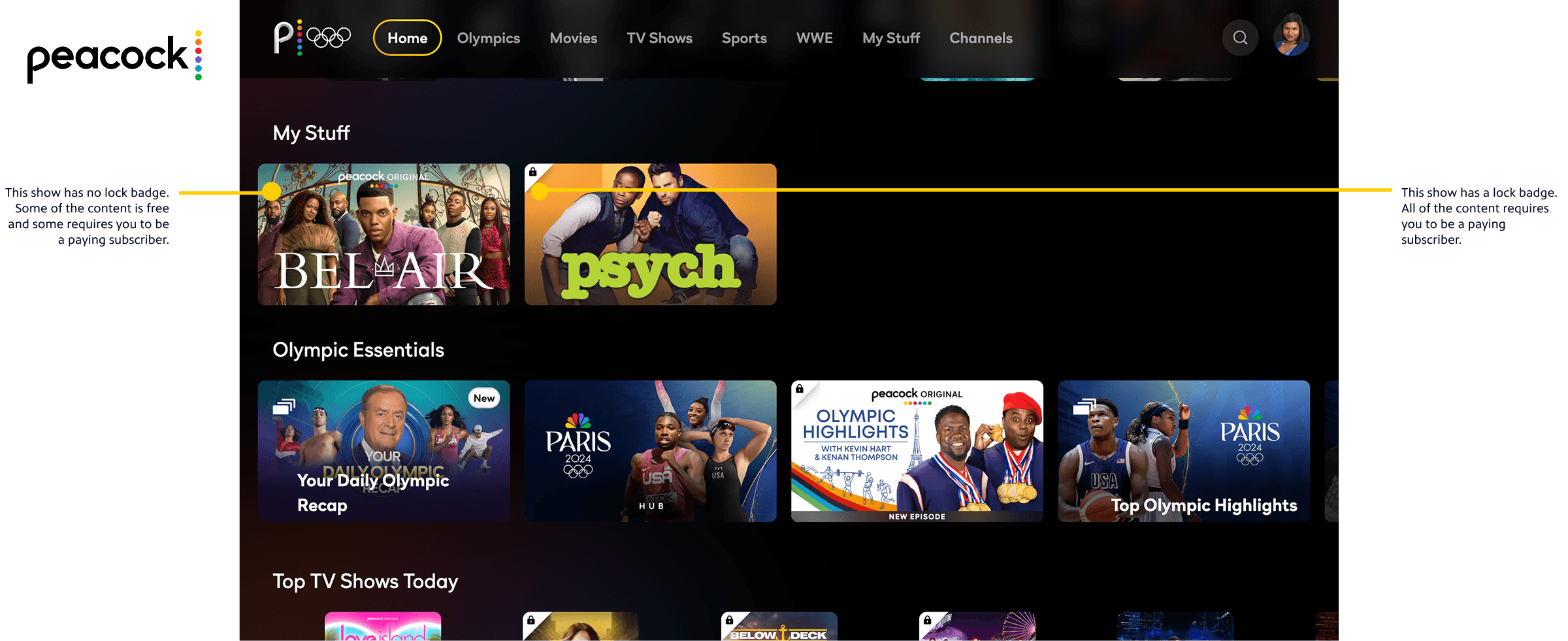
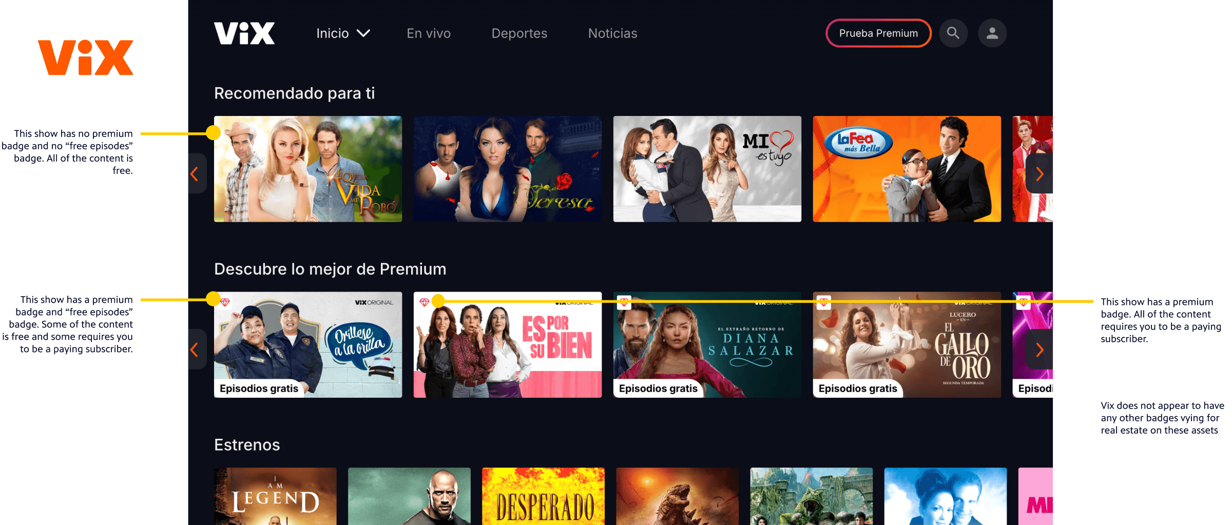
When a viewer donates to their local PBS station, they become a member and get extended access to PBS content via PBS Passport. This has strengthened digital fundraising efforts for our PBS stations across the country, and has become a pillar for sustainability across the system.
Passport has roughly 13 million streams per month across our platforms and includes popular content, such as All Creatures Great and Small, NOVA, and Ken Burns films. However, not all users know about or understand Passport, with half of app users unaware of what it is. Additionally, users often faced struggles activating the benefit.
The Opportunities
After several years in the wild, PBS Passport needed a refresh. This presented two major opportunities:
The brand team first approached my team to refresh the Passport brand with the intention of strengthening it and bringing it closer to the parent PBS brand. We also wanted to minimize user confusion between Passport and the PBS app.
In addition to updating the brand, there was also a huge opportunity to improve the user experience, which would help stations engage, acquire, and retain their donors. In 2024, our product development department garnered the resources to address gaps in our data infrastructure and the user experience for our viewers and stations.
Roles & Responsibilities
My Role
Leadership & Strategy
As the Senior Director of Design at PBS, I guided the strategy, collaboration, and execution of this redesign work. I worked closely with my team and others on a weekly basis to ensure our designs serve PBS audiences, stations, and internal stakeholders as best as possible. I helped generate alignment to ensure broader buy-in and worked with design team members to keep the project on track. I also onboarded a UX Director new to our team during this process.
Hands-On Design
Because we had a relatively small project team, I also designed specific parts of the experience to help maintain velocity, including in-app donation and gifting user journeys and designs.
Collaborators
My closest partners in this project were UX Director Amy Rubino and Sr. Interactive Designer Iko Gabay for the Passport experience redesign. We pulled in Associate Designer Grace Forster to flesh out in-app donation designs across our other apps platforms. I also led the Passport rebrand with Interactive Designer Laura King and Brand Designer Aereen Lapuz. Throughout the work, we collaborated closely with teams across the PBS ecosystem, including product management, engineering, marketing, video strategy, station services, and representatives from our PBS stations.
98%
13M+
86%
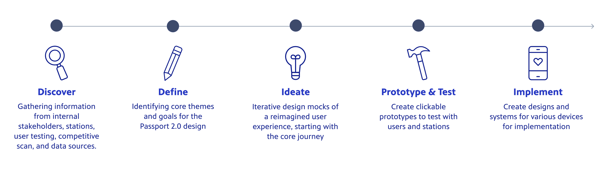
Design Process
🎨 Rebrand
Competitive Scans
After initial meetings between design and brand, we organized a few moodboards and competitive scans to kick off the rebrand:
Badging for premium content on video streaming platforms
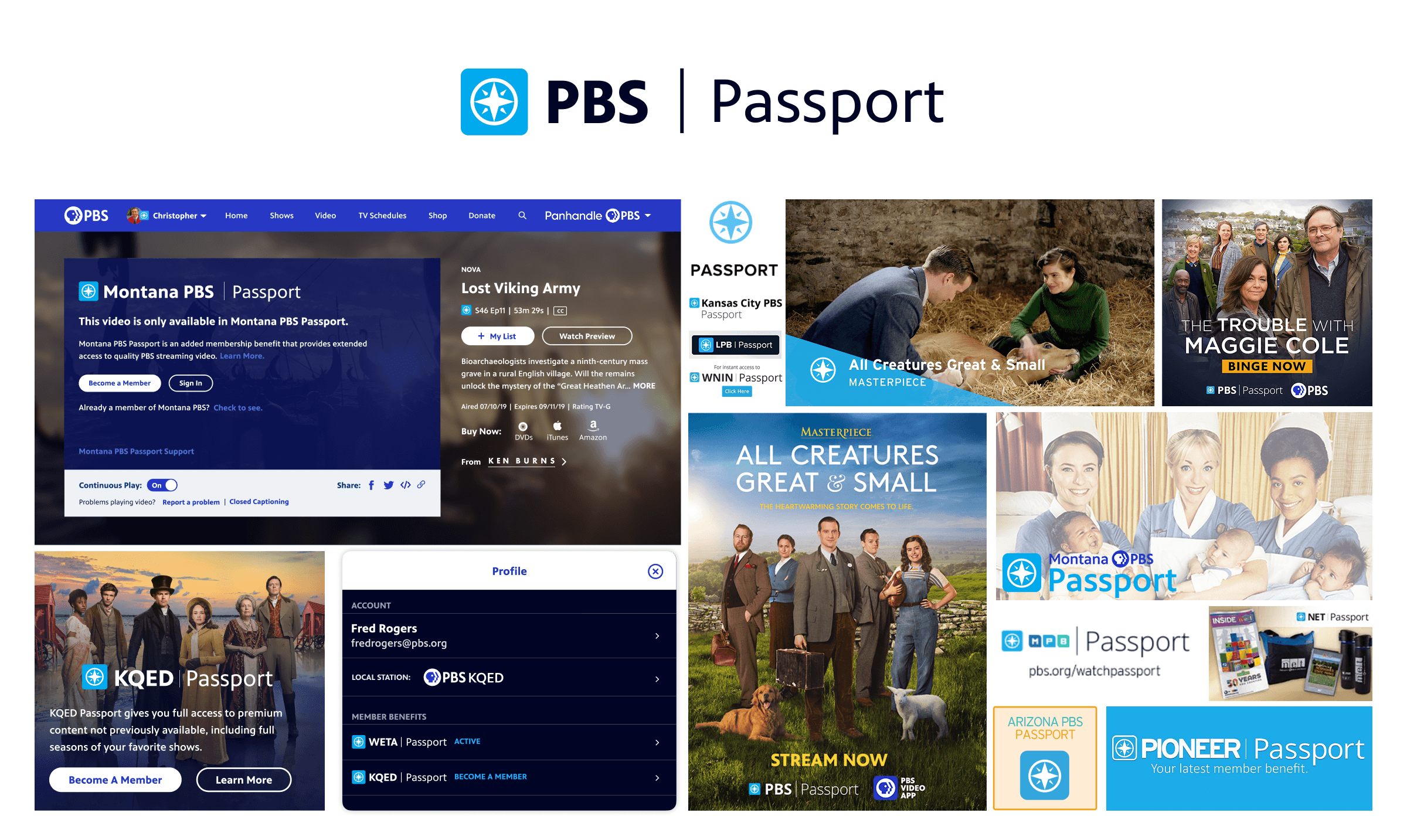
Imagery for the compass rose, the existing iconography used for Passport
Competitive Scan Snapshot
Design Explorations
To improve the Passport brand, we pulled together examples reflecting the different ways it appeared across our digital products, promotions, and station websites.
Passport Before the Rebrand
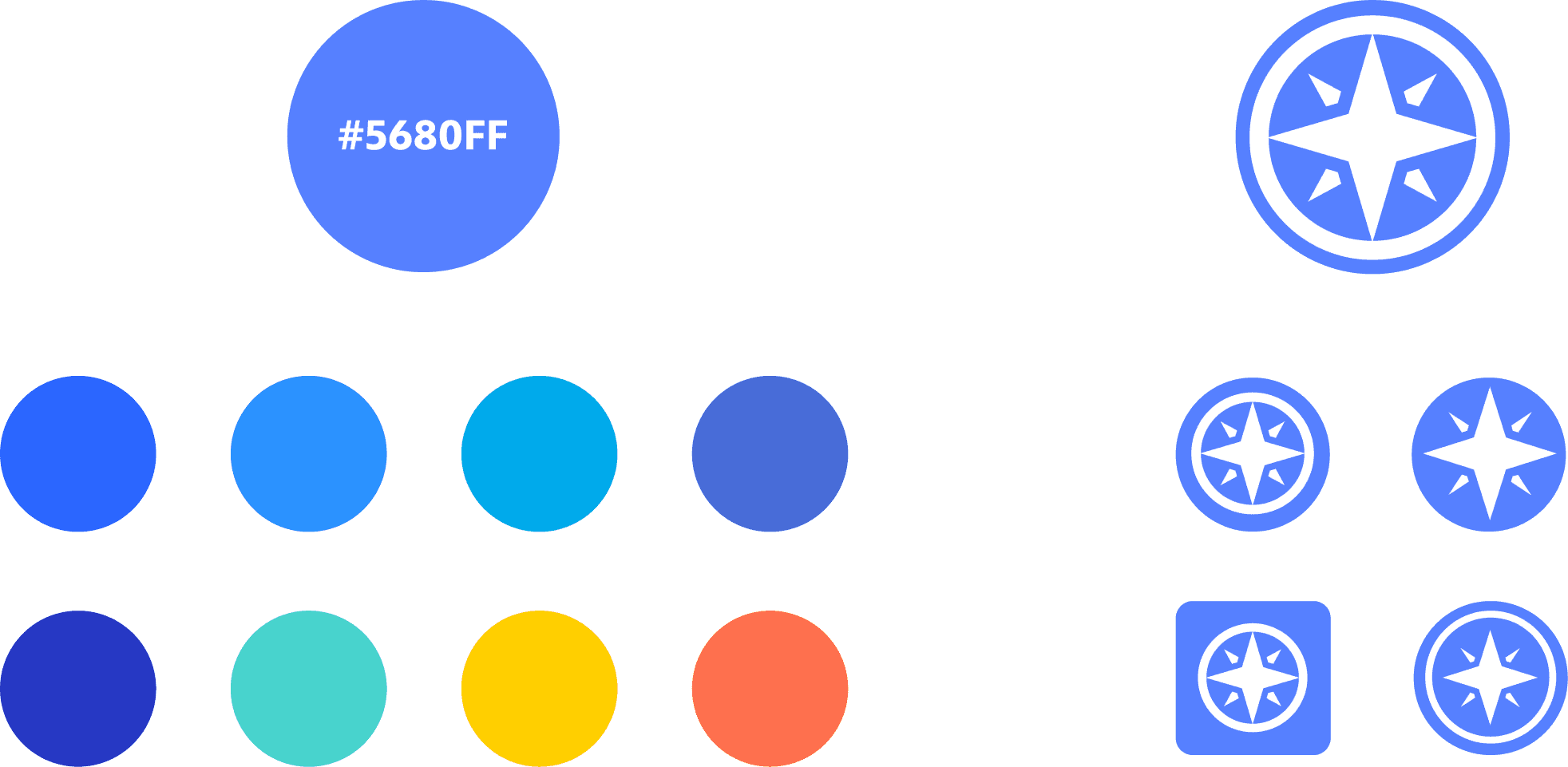
We iterated on the iconography to see if it would be helpful to simplify it. We landed on an icon that would work well both in the lockup and in a variety of badging placements.
The designers also explored a variety of colors. I wanted our team to focus on blues that would fit seamlessly into the PBS brand, but visually stand out from the rest of the experience. After looking at the variety of options, we landed on a vibrant blue that would contrast well against a wide array of imagery.

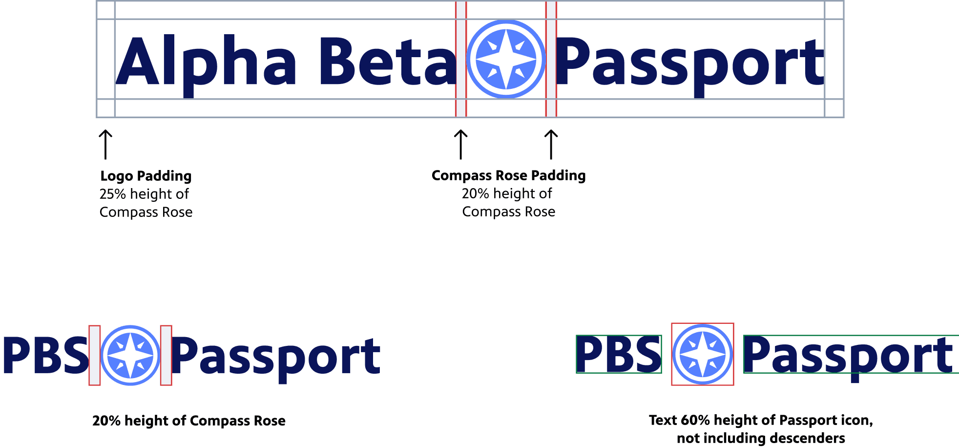
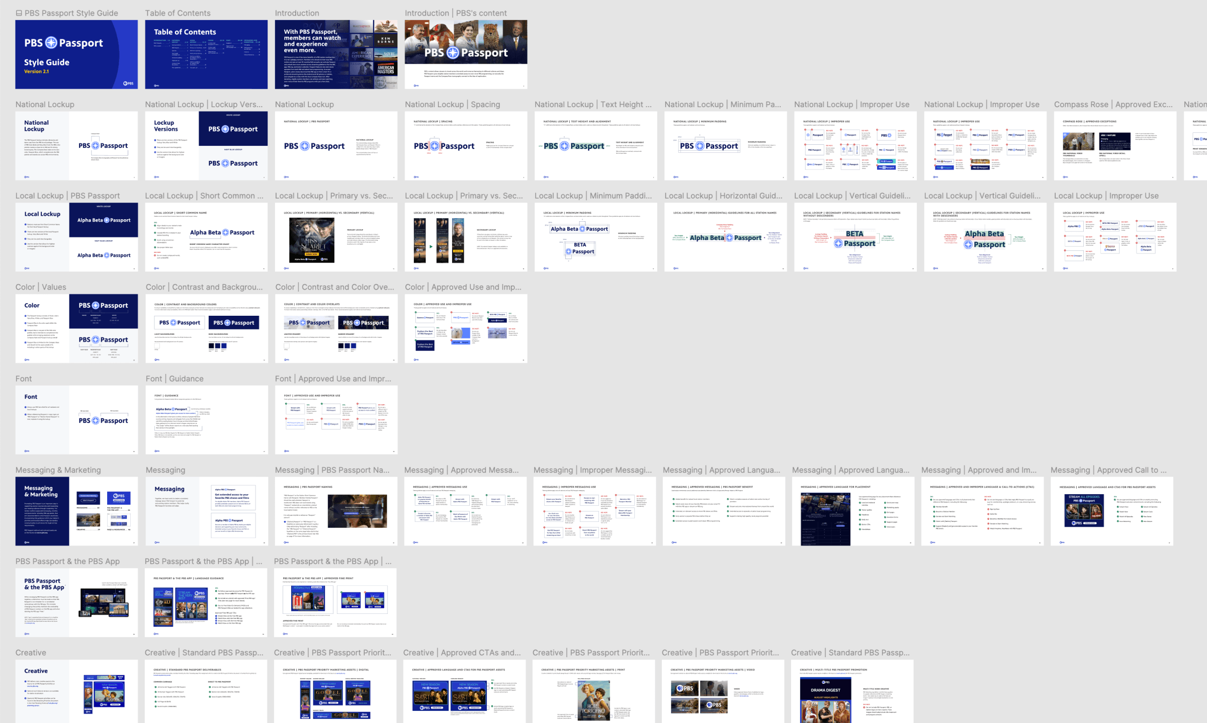
After testing a variety of typographical options, we landed on a clean text treatment in PBS bold and removed the extra pipe from the old brand. After sharing the newly proposed brand with stakeholders and our legal team, our brand designer created a full style guide that could then be shared across PBS and our stations. Throughout the process, I provided direction and feedback on the designs and presented our team’s work to stakeholders for buy-in.
Usability Testing and Implementation
Our UX Director at the time, Chris Koth, ran usability testing to ensure that users would easily recognize the new brand and understand what it meant when seen within the video streaming experience. We decided the designs were successful, shared with stakeholders and leadership, and then worked with the engineering teams to implement the updates.
Learn More Page Redesign
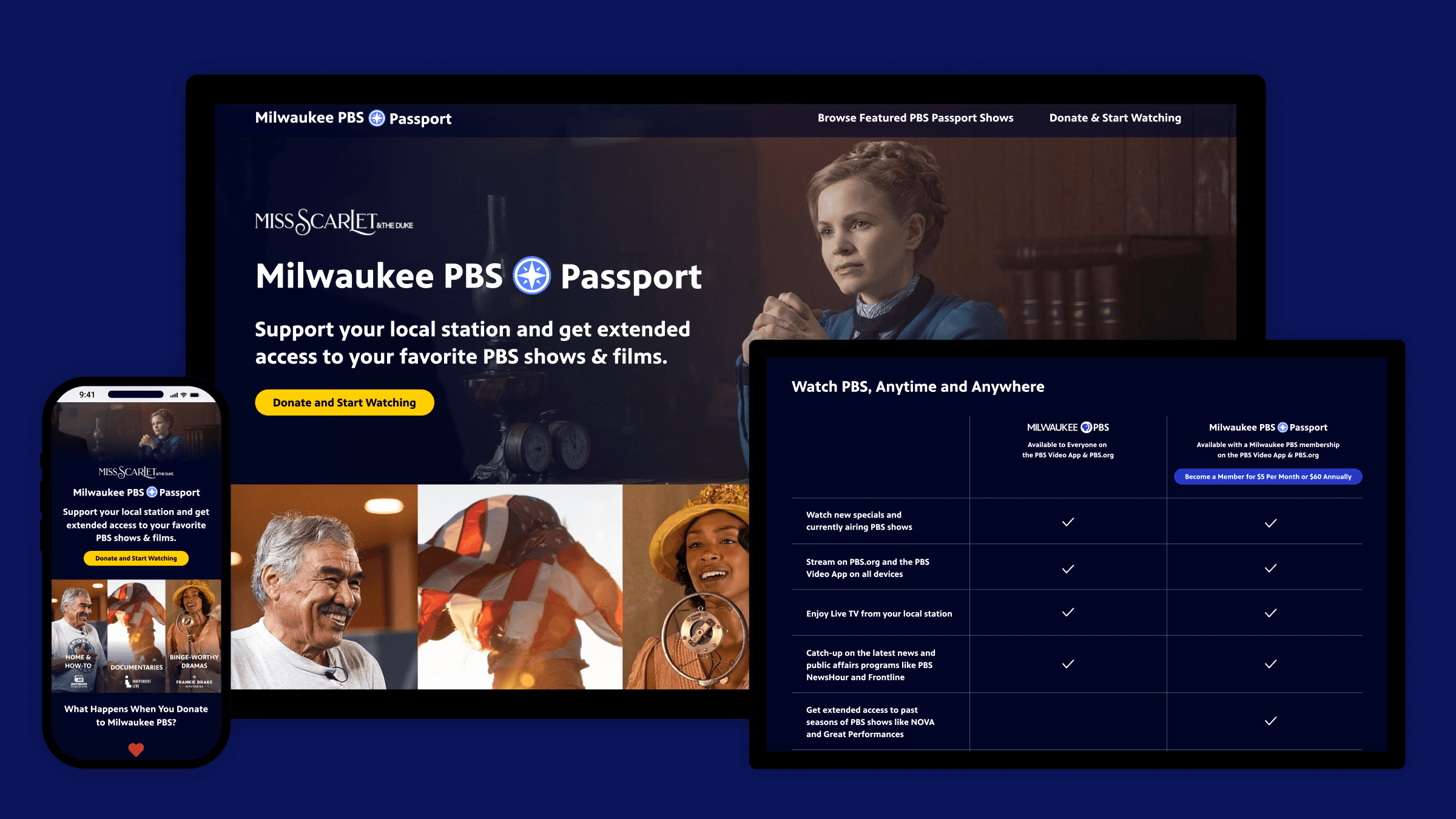
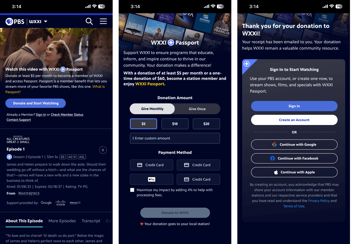
Following the PBS rebrand and ahead of a broader user experience overhaul, we identified an opportunity to improve the Passport marketing page on the web. I led the design team in updating the page to align with the new visual identity. We made it more immersive and engaging by incorporating dynamic show imagery and adding a chart comparing what you get for free versus with a donation. I encouraged the team to think big and refine the messaging to more effectively communicate the value of donating and becoming a member. This required more conversations with stakeholders and lawyers, but was well worth it to help users understand better Passport.
Under my direction, we reframed PBS Passport from a subscription-style perk into a message that celebrates both exclusive content and also the deeper value of supporting public media. The campaign encouraged donations not just for extended access, but for the satisfaction of sustaining a mission-driven service that keeps PBS free and accessible to everyone.
🔍 Discovery
Stakeholder Interviews and Surveys
For the broader user experience overhaul, we embarked on several discovery activities to better learn where there was room for improvement. This included station and stakeholder surveys and interviews led by our UX Director. We continued to work with stations throughout the process via a Station Working Group.
Qualitative and Quantitative Research
We reviewed existing quantitative and qualitative research, including a Passport User Survey and a system-wide fundraising audit. I also tasked our new UX Director to lead exploratory usability testing to evaluate the current experience, with the added value of building her familiarity with it.
Discovery Takeaways
Our research revealed common wishes for:
A streamlined and modernized user experience
Opportunities for easy station customization
Eliminating confusion between app and Passport activation
✏️ Definition
Before ideating, our team pulled together our primary design goals to keep the team focused and align with internal and external stakeholders. These were based on the larger Passport rebrand strategy, combined with what we learned in the discovery phase.

💡Ideation
Design Brainstorms
When kicking off such an impactful redesign, I like to get the entire design team together to brainstorm ideas. This helps us generate as many ideas as possible at an early stage. Brainstorming sessions are also a great opportunity for designers to contribute to projects they don’t typically work on.
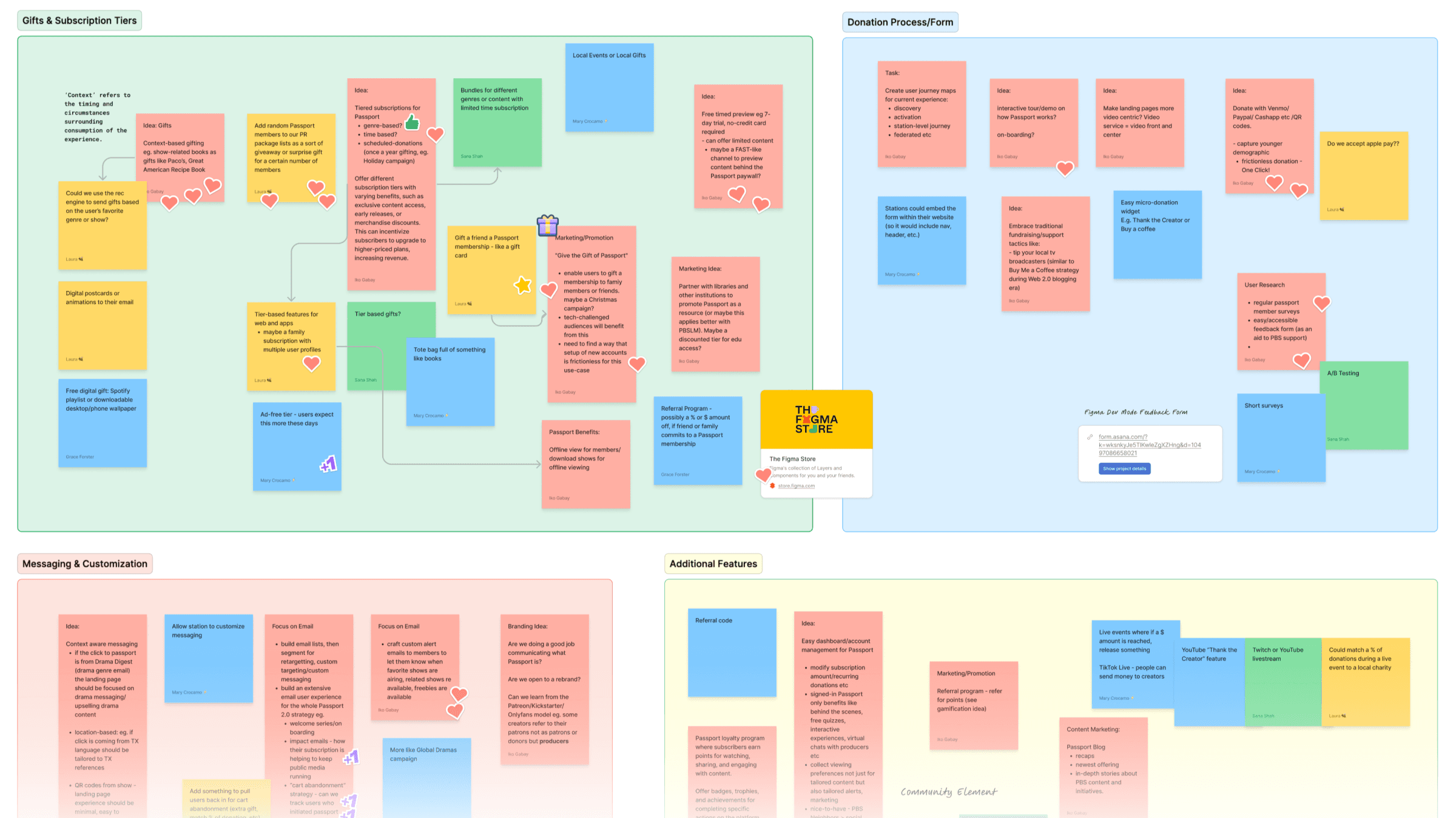
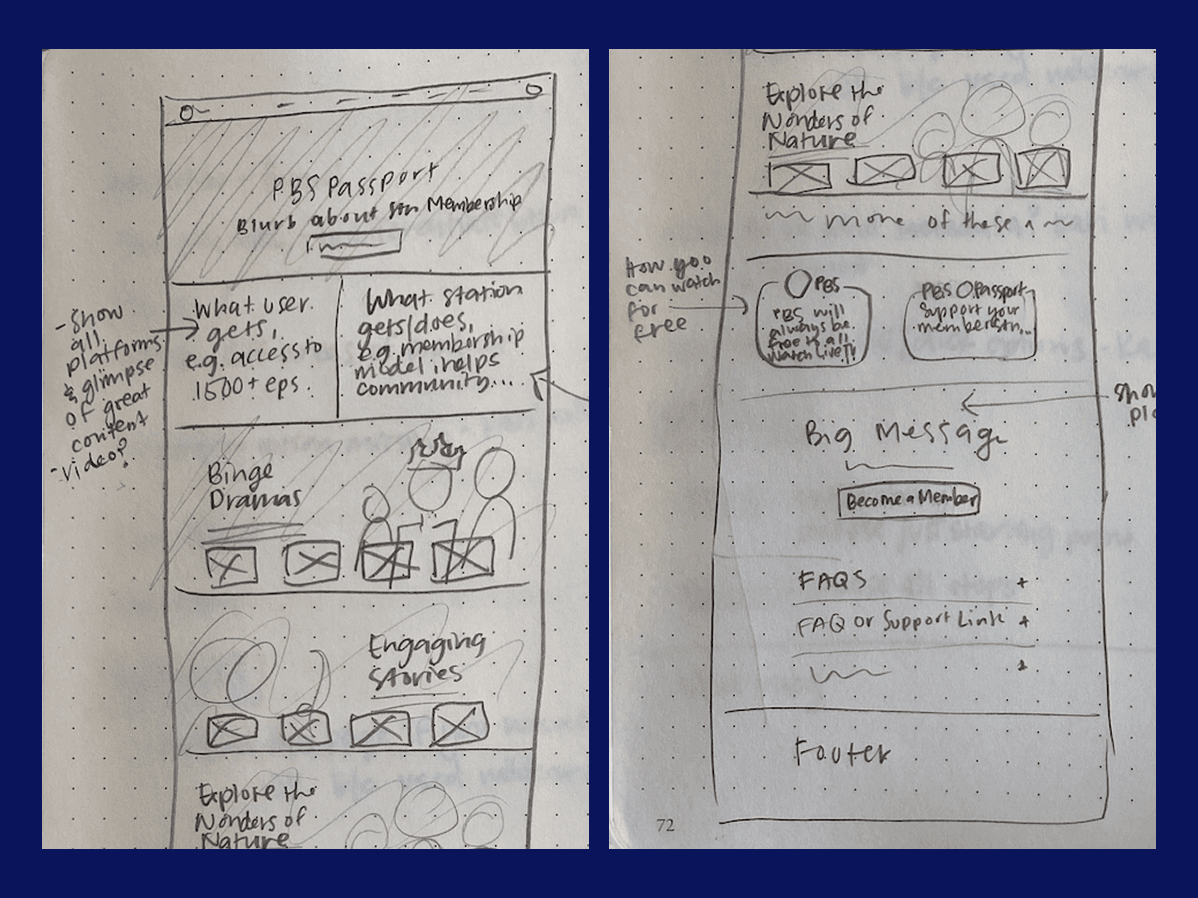
Initial Concepts
After our brainstorm, a few designers and I put together a set of concepts reflecting the most promising ideas. I pulled these together into a consolidated deck, creating a starting point for us and the product director to align on what we would like to focus on for the minimum viable product. Based on our discovery work, we decided that improving the donation form and activation process would offer the most value for stations and end-users. Shortly after, we would add a self-serve portal for users to manage their membership.
🔨 Prototyping
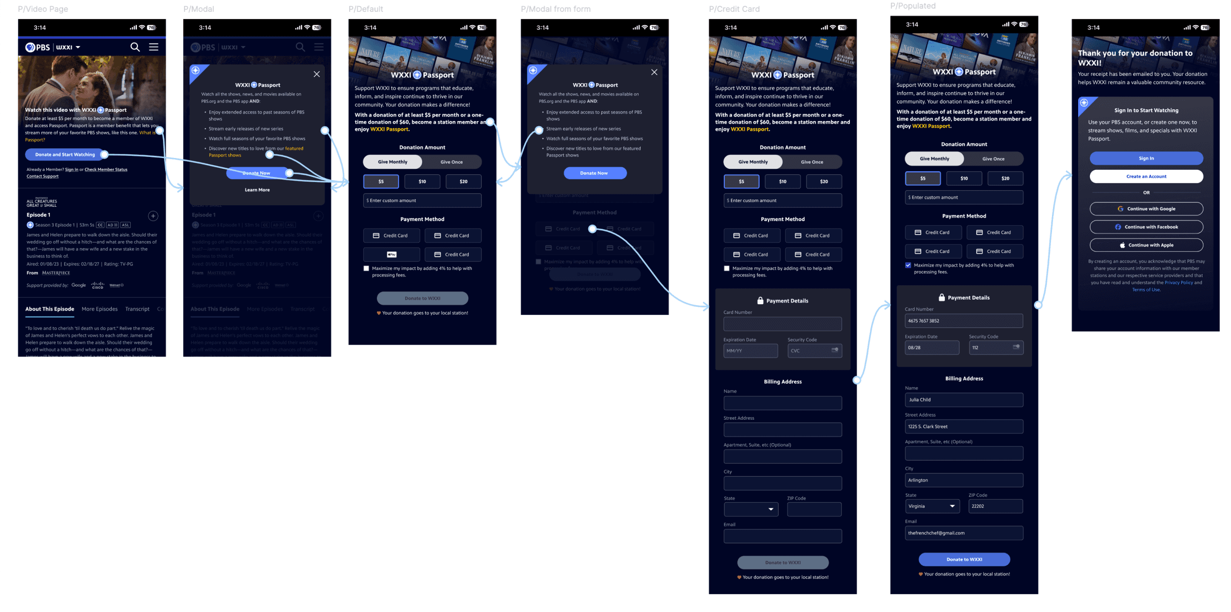
After the conceptual phase, I worked with our UX Director and Sr. Interactive Designer to design and refine the user flows for the donation process and user settings. During this stage, our team faced some frustration around the limits of what we could change, given legal and business model constraints. I helped reframe the challenge by focusing on what was possible—reminding the team that great design often comes from working creatively within boundaries. Through this lens, we streamlined the process for users to donate and start watching, cutting it from ten steps down to just four.
We were able to use these prototypes in presentations across the system to socialize the upcoming improvements and align with stations.
📋 Testing
To validate our ideas, we did quick usability testing to confirm that users would be able to move through the flow easily. This testing helped us land on how to display the different payment options.
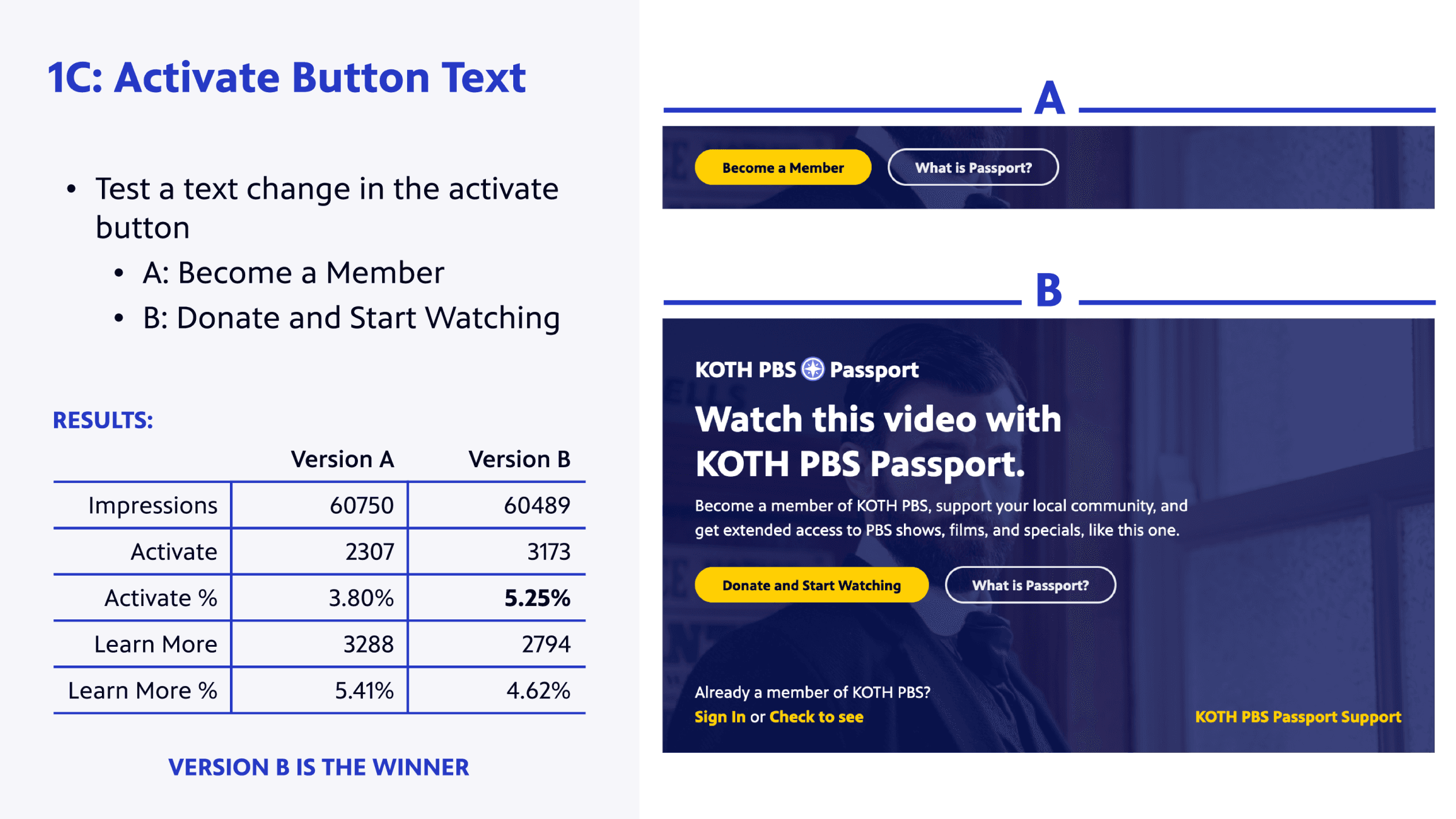
We also previously took the opportunity to A/B test language when updating the Learn More marketing page. Among the changes, we learned that “Donate and Start Watching” led to a 1.45% increase in activations compared to the old call to action, “Become a Member.”
Example Insights
1.5% increase in activations with “Donate and Start Watching” call to action.
Changing the color of the button from white to yellow increased the number of clicks.
2.67% increase in clicks with "What is Passport?" call to action.
📐 Implementation
After ensuring we had buy-in from stakeholders across the system, the Sr. Interactive Designer started putting together the finalized, dev-ready designs. These included different breakpoints, considerations like hover effects, and a full design system. He and the UX Director could then work closely with the engineers to develop the improvements. I encouraged the team to set up weekly meetings and a slack channel for communication.
For features that turned out to be a particularly heavy lift, we also discussed how we might tweak the designs to achieve our same goals in a way that is more efficient to build. As the engineers worked through different parts of the redesign, they would share their in-progress work with us to get quick feedback before publishing.

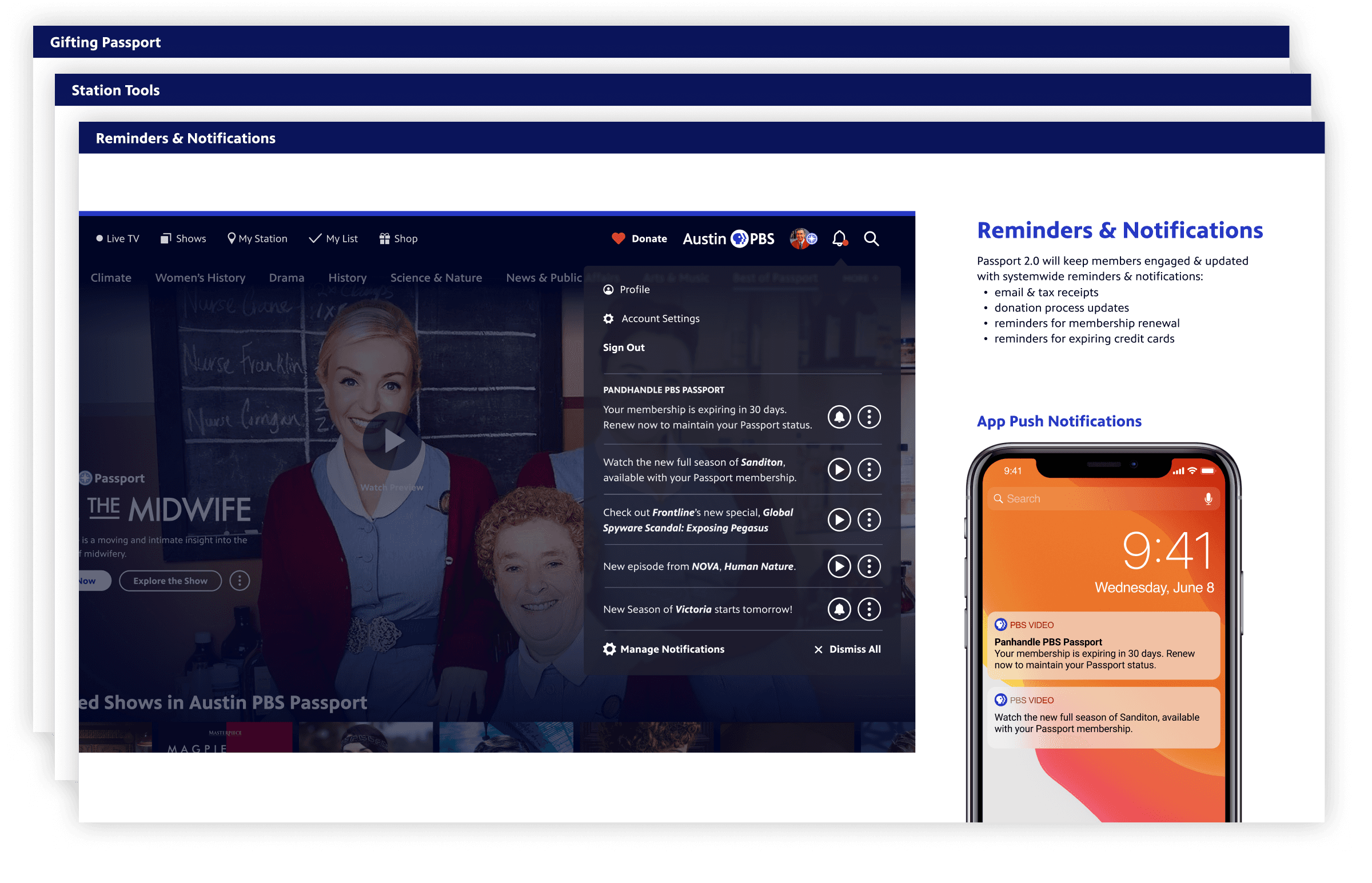
Key Features
Streamlined Donation and Activation
In our research phase, we identified activation as the biggest opportunity. Not only were users getting lost partway through activation, but both users and PBS staff were often conflating Passport activation with app activation. In redesigning the donation user journey, we managed to trim Passport donation and activation from ten steps down to four. We reassessed the language throughout to avoid further confusion.
Personalized Microdonations
In addition to the primary Passport flow, we also explored the idea of giving users more opportunities to show love for PBS via donations.
Gifting Membership and Passport
Throughout interviews, we learned that many people are setting up Passport for their parents. We saw this as an opportunity to design a flow optimized for this experience.
Beyond these features, the entire experience got a new, streamlined look and feel, modernizing the experience overall and drawing it closer to the PBS brand.
In-App Donations
Throughout this work, we incorporated in-app donations on as many platforms as possible. This makes it even easier for the user to donate to their local station to become a member and get extended access to PBS content.
Reflection
Impact After Initial Work
The Passport refresh and initial user experience improvements strengthened brand recognition and reduced confusion between Passport and the PBS app. Our design work contributed to these impact highlights:
+11 points increase in user satisfaction (to 86%)
12% decrease in reported sign-in difficulties.
1.5% increase in activations from the new call-to-action language
98% activation success rate
$19M+ generated for stations via new technologies
$5M+ in donations generated via streaming platforms after launch.
Donors using the new form were more engaged across the board. They more likely to renew (11%), use Passport monthly (20%), download the PBS app (19%), and rate their experience positively (13%).
Expected Outcomes and Next Steps
We’ve taken a data-informed approach to continuous improvements in the Passport user experience and expect strong outcomes from:
Customization options for stations, addressing long-standing station feedback. This should drive greater adoption of the federated form and help stations manage data and donor engagement, including churn, activation, and conversion.
A new self-service donor portal is expected to reduce support volume, freeing up national and local resources.